Polymer Photogravure for More Photographic Intaglio Prints
by Jon Lybrook jon@intaglioeditions.com
I've written about this
procedure as documentation, and to assist those interested in achieving more
continuous-tone quality from their polymer plate prints. It has taken several
years of first-hand trial and error and the advice of many
experts from various disciplines, cited below, for me to develop this
approach. It is not for beginners, and definitely not a cheap or easy method to
printmaking. Making photogravure plates in this manner requires an investment
of time and money, but I hope this document saves you a great deal of both, and
allows you to create beautifully satisfying, archival, polymer photogravure
prints!
This procedure will not achieve the same level of detail and resolution as the
holy grail of these processes: Copper Plate Photogravure. The goal of this method is to make prints that attain a level of quality
somewhere in between the standard, contrasty, and more grainy-looking polymer
plate prints many of us have come to expect, and those made via copper gravure,
coming closer to the latter, we hope.
Some people have asked, "Why not do straight photography, rather than
going through all this business of buying special equipment and screens,
generating added frustration and expense?" To photographers who have tried
intaglio printmaking the reasons are clear: Photographic chemistry is
supposedly more toxic than this process (though as Dick Sullivan once pointed out, how do
we truly know polymer photogravure is a non-toxic process? Well, Dick's
suspicions were not off-base. Photo artist Karl Koenig reported to me that he had used
one popular brand of polymer plate for 2-3 years doing washout with his bare
hands with no problem. Then one day out of the blue he developed a painfully
blistering and severe skin reaction from a buildup of toxins in his skin which took many months and doctor visits to correct.
Karl now wouldn't think of processing a polymer plate without nitrile gloves.
I'm with him.
Health risks notwithstanding, we do intaglio printmaking for several aesthetic
reasons. We do it because A) it is first and foremost, more archival than
standard photography, digital or otherwise, B) it is certainly less immediately
toxic than the chemicals used in copper gravure, C) it allows us to employ many
creative and traditional printmaking techniques that straight photography
doesn't, such as a la poupee and chin colle, and D) it offers a wider range of
papers to use. Until the technology or the standard approach changes, results
of this process will probably never look as sharp nor
as continuous in tone as a silver gelatin or giclee print, nor should that be
expected. The approach I am proposing herein has, however, brought us a couple
of steps closer.
This procedure requires a computer, some intermediate knowledge of intaglio
printmaking and Photoshop, a "professional" grade inkjet printer, a
vacuum frame and metal-halide exposure unit, some especially fine, custom
aquatint screens, anti-static supplies, and some gorgeous, high-resolution
images worth printing. The exposure unit I use is an Olec 5000, using a
Spectramatch Lamp model L1261, which is designed to output the precise
ultraviolet light frequency that these polymer plates are most sensitive to.
This documentation has been written for my particular work, equipment, and
taste. Please feel free to use it as a guideline to develop your own procedure
en route to making beautiful polymer photogravure prints. - Jon Lybrook
Addendum: 7/1/08 - The better plates we produce, the more an expert level of
skill as a printmaker is required to render the subtleties and details
contained in the new plates.
|
Table of Contents |
|

I.
Create the
Inkjet Image Transparency
A.
Find or create an image worth printing (preferably in
RGB, 16bit - working in 16bit allows your process compensation curve (discussed
later) to do less damage to the tonal continuity of your image). Scan, transfer, or otherwise get your image into
PhotoShop or another image-editing program that works with your inkjet printer.
As of the date of this document, I use the Epson Perfection 4870 Pro scanner.
Mark Nelson, author of Precision Digital
Negative once posted some notes about
scanning to the Alt-Photo-Process
Newsgroup you may find useful.
B.
Cleanup and modify the image content. The clone and healing tools in Photoshop are your
friends for this part of the process.
C.
Now that your image is cleaned up, convert the
Photoshop Profile of the image to
Gray Gamma 2.2 if running Windows (Gray Gamma 1.8 for Mac). This can be found
from the Photoshop CS3 Menu under Edit | Convert to Profile. Profiles can undo
you if you choose the wrong one, so be clear about which one has been applied
to your image.
D.
Create a Levels Adjustment Layer, and tighten up the Head and the Toe. Don't be
afraid to clip the blacks and highlights a little if it helps the image. When
working with a 16bit image the amount clipped will be less than working in
8bit. Adjust the midpoint to taste but with caution.
E.
If your image needs further adjusting for tonal
balance, create a Curve Adjustment Layer and tweak it until it looks best on your screen. If you're unfamiliar
with Levels and Curves, visit Dan Burkholder's website TinyTutorials.com and bone up!
F.
Now resize your image to 100% of the size you want at 360 ppi (Mark Nelson
offers that 360 ppi provides optimum sharpness, based on the fact that it can
be divided evenly into 1440 or 2880 printer driver resolutions). You should
also size your transparency such that it is smaller than the size of the plate.
If the transparency is larger than the plate, the transparency gets bent over
the lip of the plate, causing a dark shadow along the perimeter in some cases.
Keep in mind, unless you've gone to the expense of
having your monitor and printer properly calibrated, and do it regularly, what
you see on the screen may not look precisely like what comes out of your
printer. Simple calibration systems are out there that
have you compare what your monitor looks like to a color chart with accurately
printed colors. This approach is often adequate.
G.
In order to get
a broader range of shadow detail, a process compensation curve is, in fact,
required to get the broadest range of shadow detail form your print. Most of
the image detail is natively retained using the approach contained herein,
however shadow detail will get buried in most images without an adjustment to
the curve. A good process compensation curve basically lowers the contrast of
the image. Contrast is then naturally reintroduced when it gets transferred to
polymer plate. Without it, the image will appear too contrasty - especially in
the blacks. Just as making a photocopy of a photograph increases contrast, so
does transferring from film to plate. Note that you may have multiple curves
applied to an image using adjustment layers (another good reason to use them as
opposed to modifying the curve of the image directly). You can have one curve
to adjust the overall tone of the image, then apply the
process compensation curve on top of that. The latest process compensation
curve I have been experimenting with can be downloaded here.
This curve is a suitable starting point for images sized to 360 ppi and printed
out at 1440 dpi with 'black ink only' selected in the printer driver. (Note
that 'black ink only' does not use light black or light light black, in case
your printer has those - it is indeed only black ink that's used.
Unfortunately, when running head cleanings, all ink colors are used, which is a
horible waste, but that's the cost of doing business. The good news is, if a nozzle check indicates banding with any color other
than black, it doesn't matter.) It was tested using an Epson Stylus Pro 7800
printer, but the ideal curve will be different from printer to printer, even
among the same model printer... Do not apply the process compensation curve
just yet.
How to best derive your own process compensation curve (determine exposure
times and setting levels too) can be found in this book: Digital
Negatives: Using Photoshop to Create Digital Negatives for Silver and
Alternative Process Printing by Ron Reeder.
H.
As a final check
on your flattened image, open up the Threshold tool in Photoshop under Image |
Adjustments | Threshold. Make sure the histogram represented covers the entire
length of the graph, just as it should have been between the pointers in your
levels adjustment. If there's too much white space on the head or the toe, your
image is lacking 100% white or 100% black. We need this for a perfectly
balanced image, so see if you see the need, go back and adjust your levels or
aesthetics adjustment curve (as opposed to process compensation curve) again.
I.
After all your
tweaks have been done, smart sharpen the image (if needed), apply the
compensation curve, and then finally convert to 8 bit.
Apply your process compensation curve to the final image by adding an
Adjustment Layer Curve, the click the Load button, and choose the ACV file from
your local hard drive. Flatten the image again.
J.
The image is
almost ready to print. Create an empty grayscale image the size of the media
you intend to use at 360 ppi, so that it corresponds to your image. Copy and
paste your image into this new image. Drag guides to surround your image tightly,
and then use the Rectangular Marquee tool to select only the image. Save the
image as image-working-copy.psd or something
meaningful.
K.
Make sure you
leave enough of a border around the image. Printing right to the edge of the
Pictorico is not recommended as it may smear.
L.
One final reminder: Be certain your profile in Photoshop AND in the PRINTER DRIVER are set
correctly! Gray Gamma 2.2 for
Windows, Gray Gamma 1.8 for Mac. If set improperly your tonal range will be
sacrificed considerably.
M.
Finally, print your image using the Epson 2200,
Epson 2400, 3800, 4800, 7800, 9800, or any of that lineage
of inkjet printers on to Pictorico OHP Premium
Transparency Film. For your black cartridges, be sure to install Photo
Black (not Matte Black). Under the Advanced setting of the printer driver, check Black Ink Only and Print Preview,
uncheck Image Smoothing and uncheck High Speed Printing. Also choose the Premium Glossy Photo Paper paper setting
in the printer driver at 1440 dpi
(if you are using my sample curve given above). This will dump the proper
amount of ink onto the Pictorico OHP Premium stock that corresponds with the
plate exposure times listed below for my process (your mileage will vary).
N.
Examine your
transparency for dust or scratches. Lightly dust the Pictorico media with
DustOff ™ or other canned air before printing. Make sure the media goes in the
correct direction into your printer. The clipped corner should be in the upper
right-hand corner when positioned in your printer. Do not stack the media. Load
it one sheet at a time, as needed. From the Maintenance Section of the printer
driver, run a head cleaning before you
print to ensure no lines show up in your transparency. This uses ink, but
ensures smooth tones and avoids evil microbanding. On the Epson Stylus 2200 I had to run a head cleaning before every print to ensure no
microbanding would appear on my transparencies. This is not currently the case
with my 7800 and I only run a head cleaning when the printer tells me to, or if
I see microbanding. Let dry for 2 hours at a minimum, but ideally 24 hours. The
longer dry time gives the benefit of added time for the ink to set, making it
less subject to moisture, fingerprints, and scratching if you plan on
transporting it before, or preserving it after making your plate. Just before
using the transparency to burn a plate, I dry it with a hairdrier or in a print
drier for about 20 minutes (see below).
O.
The
transparency, when viewed on white paper in normal room light, should give a
good indication about what the final print will look like in terms of density
and tone, taking into account the actual print will have greater contrast.
Don't make the plate until you have the transparency right!
P.
So, to recap the image preparation process:
1.
Acquire image in
RGB 16bit
2.
Use NoiseNinja
3rd party filter (optional)
3.
Cleanup and
modify
4.
Convert Profile
to GrayGamma 2.2 (Windows)
5.
Head and Toe the
Levels (clip up to 5% to help with contrast if needed, but use with restraint).
6.
Apply Adjustment
Curve to taste
7.
Flatten, and
check Threshold - re-tweak as needed
8.
Undo Flatten,
resize at 360ppi, Smart Sharpen if needed
9.
Print an inkjet
proof on GLOSSY paper, to verify it looks good and for comparison later. (The
ink and driver settings we're using are designed for glossy media. Printing on
matte paper will show a duller tone than what the final print should contain).
10.
Apply your
process compensation curve
11.
Flatten
12.
Convert to 8bit
13.
Print onto
Pictorico OHP using Gray Gamma 2.2 in your printer driver if Windows (1.8 if
Mac)
II.
Image &
Screen Relationship
A.
As you will
learn below, first we expose a dot screen (often referred to as the
"aquatint" screen), then the image transparency to the plate. The
screen exposure creates a consistent pattern of random black dots across the
plate. The image exposure "burns off" the dots in the areas where the
image is white and essentially leaves the dots alone in the areas where the
image is black. But not entirely. If we didn't first expose with the screen of
black dots, areas of the image that are black would wash out when the plate was
developed, resulting in 'open bite'. The screen ensures a tooth where the ink
can sit.
B.
The image and
screen exposures actually affect one another on the plate. My sense is that
when creating polymer plates with inkjet-produced image transparencies there is
a dependency on the fact that inkjet does allow light to pass through somewhat,
as opposed to imagesetter transparencies which are dead-black, opaque dots.
This image translucency interacts and affects the screen exposure/dots to a
certain degree. Where the screen dot overlaps with an image dot, you've got a
slightly harder black dot than you would without the image exposure step, since
there will be a little light coming though the transparency even in the 100%
black areas of the image (since inkjet ink isn't truly opaque). If you only exposed
the screen without the image exposure, the blacks you'd get would be different
- perhaps exceedingly rich with a tooth beyond what you want. That's my theory
at any rate. I just know when testing to get a proper exposure time to get a
solid black with the screen, and did, once I determined the optimal exposure
time for the image, I wound up backsliding a little and changing the screen
time in the end. Exact exposure times I'm currently using are below.
III.
Test and/or Expose
the Plate
A.
When you get a
new batch of plates in, don't assume the exposure will be the same one batch to
the next. Age and handling of the plates could affect the exposure time. If
your first plate comes out with an exposure different from what you expected
based on past experience, expose a 5x7" test plate using one of Jon's step test
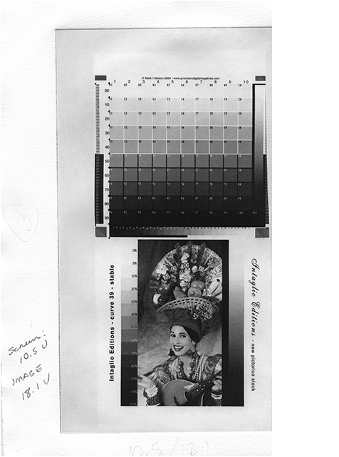
images. The Adobe
Fruit Lady serves as a very good referencing image. Print this test and
tweak your adjustment curve whenever your printer or print head is replaced,
whenever you change the kind of media your using, whenever the manufacturer
changes the ink or media formulas, or whenever you change just about anything.
Identical printers models may still differ in the amount of ink that gets
deposited on the media.
B.
Determining exposure times for the very first time can be difficult. As cited above, the ratio of
screen to image time is critical. But how to start? Here's a method I used:
Expose a 5x7 test plate with the fine stochastic screen starting at 6 seconds
at 5,000 watts and increase in 1 or 2-second increments, moving horizontally
down the plate one inch per exposure. If you are using the recommended UV metal
halide lamp, be sure to wear adequate UV
eye protection! Once the screen has been exposed, take the gradient_circle_steptest.psd
360 ppi file (printed on Pictorico OHP Premiums tock),
and expose vertically, also starting at 5 and increasing in 1-second
increments. Process and print plate per the procedure below. Adjust exposure
accordingly. Your times may vary depending on the available wattage of your
exposure unit, age of the bulb, age of the plates, and other factors.
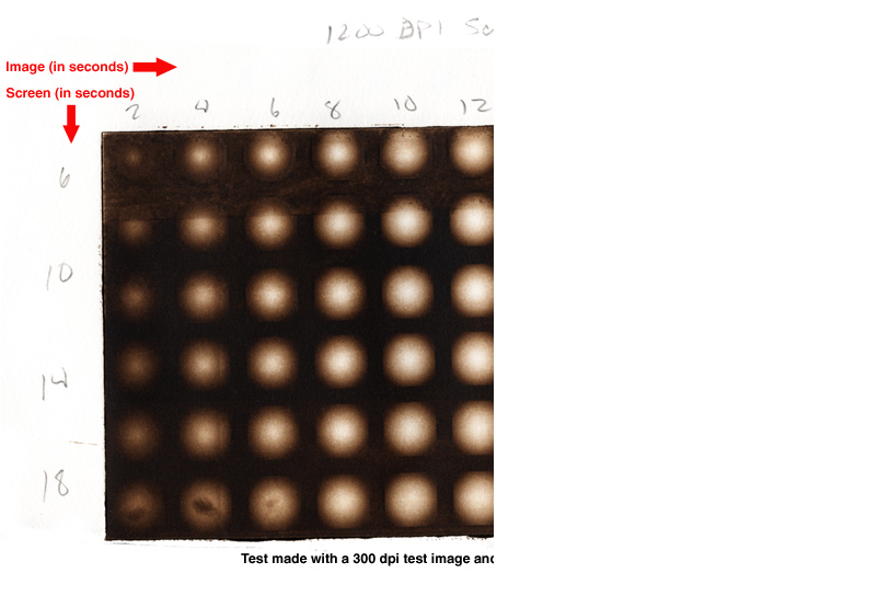 .
.
The ideal cross-reference is
going to be an evenly balanced gradient circle, like the circles in the
original transparency where they are are all identical. You can see in the test
above how the subsequently longer exposure time of the image (starting with 2
and ending with 20 seconds) burns away more and more of the image until you go
from a nice gradient circle to an almost totally white circle. Likewise, note
how the increased screen time (delineated by 6, 10, 14, and 18 seconds) goes
from opaque, dark tones, to a nice balanced set of tones at 10 seconds, then to
increasingly brighter, solid tone under the longer exposure times. This is
because, as the plate takes on more exposure time under the screen, more light
passes around the dots on the screen, and decreases the diameter and depth of
the dot on the plate, which then holds less ink, and creates a lighter tone.
This step test is a more economical approach to doing a standard step-test
using an actual image because, unlike using an actual photograph with varying
and random tones represented throughout, here, every tonal value from 0% black
to 100% black, is readable in each square inch of this test, allowing for more
information in every cross reference point. Final exposure times will still
require a little tweaking, but the above step-test should help you to get to
that ideal set of exposure times sooner. Note that in addition to exposure
times, the duration time and method of processing your plate will also affect
tone and density! Screen exposure, image exposure, and washout time are the
holy trinity for adjusting with the physical properties of your etched plate.
The next step is to derive your process compensation curve. Once you have a
good ballpark set of exposure times use Jon's step test
images or the Adobe
Fruit Lady step wedge to refine your process compensation curve. On the subject
of deriving process compensation curves, which is beyond the scope of this
procedure, one book I highly recommend is called Digital
Negatives: Using Photoshop to Create Digital Negatives for Silver and
Alternative Process Printing by Ron Reeder. This book goes through the
steps to prepare and image and create a process compensation curve, and is one
of the more up to date instructional books (as of this writing). Once you have
a curve that makes your step wedge look good, the refinement is not over. You
should print inkjet images (with no curve applied) and compare them to your photogravure
prints and use them, with your step wedges as reference, to further tweak the
curve to handle real-world images.
The Ideal Step Test will have a progressive range
of tones, from the blackest black, to the whitest white and as many tones as
possible in between, each step as distinctly different as you can make them.
This is where experience in the craft of printmaking comes in handy. I like
to evaluate a step test by printing it at least three times with Charbonnelle
Carbon Black ink, with little or no easywipe. This allows the plate to become
seasoned somewhat and gives an opportunity to see what the plate is doing
with no fancy additives or ink combinations to throw things off. "Black
is truth", as Dan Welden once said.
Once you see how the plate responds to the straight ink, evaluate the tones.
If they're too blocked up in the black range, add a little extra easy wipe or
00 burnt plate oil. This should open up the range of black tones. If your
whites become too dingy, back off on the plate oil, which can add extra and
sometimes unwanted plate tone. Tint base extender may be used to thicken up
the ink and bring back more solid whites. You can also try wiping the plate
longer (without over-wiping). I sometimes get a nice result from 10% easy
wipe, 10% 00 burnt plate oil, and 5% tint base extender added to the Carbon
Black ink. Its alot of additives, but sometimes they are called for. It
depends on the piece, but in the case of testing, we are trying to bring out
the greatest range possible. It helps evaluate our curve and exposure times,
as well as the things we may want to do to our ink to bring out the greatest
range of tones when we're printing something other than tests. If you've
tried all the printerly tricks and it still doesn't look right. Take your
best test, and adjust your curve or exposure times as needed, and do another
test.
There were times when I and the people who know me wondered if I was ever going to be printing anything OTHER than tests. Well,
that day eventually comes...until your printer or exposure unit dies, or the
manufactuerer changes the formula of your plates or transparency stock...then
you have to test again to get back to where you were, alas. But each round
makes recallibration all the easier.
Thanks to Mark Nelson and Precision Digital Negatives for his 101 Step wedge. Buy his e-book. It's a trove of information and resources.
|
C.
General
Guidelines for exposing polymer photogravure plates:
1.
I use Printight
model number KM 73 available from Box Car Press
as "EcoEtch gravure plates for photogravure". For a richer, more painterly look, use SolarPlates™.
2.
Expose
transparency emulsion to plate emulsion.
3.
The longer the image exposure, the lighter the image.
4.
If your blacks
at 100% are flat and grey compared to lighter blacks in your image, AND the
structure of the plate in these areas looks gritty, yet still washed out,
either your screen or image exposure time is too short.
5.
On the other
hand, too great of an exposure time with either the screen or image gives
increasingly flatter blacks, yet the plate's structure in these areas appears solid
and flat, until it becomes white (light sneaks under the dots making them
increasingly smaller with less depth).
6.
Note: If you are
planning to print colored inks, you will generally need a process compesnation
curve or plate process that provides more contrast, since colored inks appear
less contrasty than black.
7.
A point-source
metal-halide light source is the best approach for this process. UV blacklight
tube bulbs, while easier to acquire, are too diffuse and prone to problems. You
have been warned.
D.
For 'aquatint
screen' use an 80% density 1800ppi screen (output at 1800 dpi) screen with the
following plate models by Toyobo:
|
Ink Color |
Toyobo
Plate Model |
Image PPI |
Watts |
Screen
Exposure |
Image
Exposure |
Washout
Time |
|
Black |
KM73 |
360 |
5,000 |
10.5 units |
14.5 units |
47 sec * |
|
Colored |
KM73 |
360 |
5,000 |
10.3 units |
15 units |
60 sec |
|
Black |
KM83 |
360 |
5,000 |
13.1 units |
18.1 units |
47 sec * |
E.
*47 seconds equals about 52 full passes
on an 8x12" plate with a soft nylon brush. Processing time for larger
plates will vary depending on size of plate.
F.
Note that the KM83 plate requires 25% more exposure to both the screen and the
image positive compared with the KM73. the KM73 means
the layer of polymer is 73 mils (thousands of an inch). The KM83 plate is 83
mils.
Exposure times for 1,000 watts will be four times that of the exposure times at
5,000 watts.
Exposure times for 3,000 watts will be twice that of the exposure times at 5000
watts.
These exposure times are just a guide. You should test, as shown above, to
narrow down the exposure times required by your particular equipment.
G.
1. Use vacuum frame without glass. I retrofitted mine and replaced the glass with a layer of Kreene plastic taped to the frame and sealed using foam core around the perimeter of the frame above the bed. This was recommended to me by Harold Kyle, owner of Boxcar Press
. It works great! Generally used for letterpress plate making, Kreene allows for better detail rendering, such as serifs. Another advantage is you to feel the film and plate through the plastic with your hands to detect any grit or debris that you might not otherwise be able to find. Stop the vacuum and clean away any such debris before exposing either the screen or the image. I also have a bleeder cord running in the area of the vacuum holes on the bed. This prevents the Kreene from getting sucked onto the hole, preventing adequate pressure from building up. Bleeder cord can be made from string, or the ribbed plastic cord you use to hold a windows screen to the frame. I also have a piece of flat plastic (not Plexi - thinner) laying on top of the entire bed. This prevents the rubber nubs in the blanket of the vacuum frame from embedding themselves in my aquatint screen or Kreene. The Kreene plastic may need to be replaced from time to time as it gets dirty or acquires pinholes.
2.
Before exposing, clean and thoroughly anti-staticize
the Kreene plastic, vacuum frame bed and each transparency. Impress, and other
excellent anti-static products are available from Modern Solutions. Lightly mist a rag with
Impress Anti-Static Spray and clean the bed and Kreene - above and below. Spray
Impress on Flexo-wand and rub it into the fabric with a clean rag, then run the
flexo-wand lightly over the plate emulsion side of the screen and transparency.
3.
Remove protective mylar from
plate and place plate on bed. Lay aquatint screen on plate. Close vacuum frame
and power on. Smooth out air bubbles with Flexo-wand and feel plate through the
Kreene for debris. Make sure all air has evacuated. Wait 3 minutes or so and
power on light to expose the screen to the plate.
4.
Pictorico OHP Premium transparencies and the KM73
plates are particularly vulnerable to dreaded Newton Rings. Regular film, such
as the screen made from an imagesetter doesn't have such problems, however. If
you have problems with dark or light patches invading your image in the smooth
tone areas, make sure you are drying your positive OHP transparency for 20-30
minutes using a hair drier or print drying cabinet. This gets rid of moisture
contained in the OHP and reduces the tackiness it seems to have with the fresh
KM73 pates. Additionally, after drying the transparency, apply a thin layer of
baby powder to the plate and remove excess with a drafting brush, then do a
final pass with a hake brush. After exposing the screen to the plate and
dusting it, return plate to the bed of the vacuum frame. Cover with the freshly
dusted transparency and check for debris. Smooth sandwich with Flexo-wand.
5.
Close frame on top of screen and plate. Turn on
vacuum, smoothing Kreene plastic immediately over the plate and film. Wait for
all air to escape and then wait another 15 seconds before exposing. Vacuum
pressure should be around 10-14 psi or greater before exposing. Expose Screen
first, followed by Image using the same procedure. Some people have said
exposing the image before the screen is better. I don't believe it matters.
IV.
Process the Plate
A.
Get a shallow developing tray and using waterproof
glue, adhere sheet magnets to the bottom of the tray.
This makes an excellent processing tray as the
steel-backed plates will stay in place better. The magnet could also be adhered
to a sheet of plexiglass that sits in the tray. To process, put plate in tray
and cover with water. Water should be about room temperature. Scrub lightly
using a soft flat brush with little pressure, using various short, circular
motions, for 45 seconds. Douse intermittently with water. Scrub longer than 45
seconds if you want a darker, more heavily etched plate. Be consistent when
working out your washout time. Scrub too long and the darker areas of the plate
may washout too much, causing then to become a dull gray instead of a velvety
black.
B.
After about 45 seconds, remove plate from tray,
rinse, then drain and blot on clean, smooth newsprint.
To blot, put the wet plate face up on flat, clean newsprint. Cover with more
newsprint and without pressing too hard, use the side
of your hand to squeegee water from the front of the plate to the newsprint. Be careful not to cut your hand on the
plate when handling the plate! Lift plate and reposition on another section
of dry, clean, flat newsprint. Repeat 1x. Plate may stick slightly to
newsprint, but shouldn't be too sticky. A very sticky plate means it wasn't
exposed long enough. Peel paper gently from plate.
C.
Dry the plate with a hairdrier on hot for 3-5
minutes, then dry on warm or put it in a print drying cabinet for an additional
10 minutes at 122-140 degrees. This, along with the next step, helps temper the
plate to prevent scratches.
D.
Post-expose plate for 10 minutes at 5000 watts, or
put in direct sunlight for the same amount of time or longer.
E.
Examine the plate. One of the qualities copper
Photogravure has going for it over standard polymer processing is a relief on
the plate that has three-dimensionality to it. This relief can also be acquired
with polymer when done properly. If you look at the plate on an angle in good
light, you should be able to see and feel a slight depth and texture. The solid
black areas should have some depth and an even, somewhat coarse texture. A well made polymer plate will have that same quality. If the
blacks have an uneven texture and quality about them, you are probably under
exposing your screen or over doing the washout time of the plate.
F.
File down and sand corners and edges of plate using
wet-dry sandpaper. It minimizes ink lines around the printed image and prevents
finger cuts.
G.
Never get the plate wet with water once it's been
processed. It will mottle the image.
V.
Prepare the Paper
A.
Ideally paper will be prepared in a wet pack the
night before. This can be done by immersing each sheet of
paper in a tray of water and letting it soak for about 30 minutes.
Collect all the paper in a neat stack in the tray and lift it all at once and
drain it completely, until your arms ache from holding it. Place the stack on a
sheet of vinyl and fold it over the paper. Use a piece of plexiglass to support
the vinyl bag and slide the whole thing into a large garbage bag and seal with
tape. The next morning your paper should be wonderfully suitable for printing.
If done correctly, the paper should not need blotting. The first sheet in the
pile may need a quick spritz with water to rehydrate it a little, but it should
not be glistening. Properly prepared printing paper should be like a "cool
kiss to the touch", according to Paul Taylor of Renaissance Press. Not too
damp, not too dry. Use a small hand towel to buff up the paper fibers a little
bit which helps it to receive ink better.
B.
A more convenient, but less professional approach is
to soak paper as you go. This is handy if you're only making a few prints. Soak
BFK Reeves paper for no more than 1 hour. Too much soaking time can cause your
problems with how the paper accepts ink, and how flat the paper dries. As
always, be consistent if you want consistent results! Soaking Hahnemuhle paper
for more than half an hour is not recommended. If the paper wrinkles or
creases, the pressure is probably too high or the soaking time too long. I also
love Hahnemule Ingres paper which is more tissue-like
and should be sprayed with water completely, left to sit for 5-10 minutes, then
carefully blotted before printing. Other papers may work well too, but these
have worked the best for this process among the ones I've tried. Blot paper
between blotter paper or cotton towels using your hands, or a heavy roller
until semi-dry. Paper should be damp, not glistening.
VI.
Set up the Press - adjust pressure
A.
With plexiglass in place, Position bed in middle.
Raise pressure and align blankets - thinnest on bottom.
B.
Adjust the pressure of the intaglio printing press.
Note that these plates generally need more pressure than other types of
printmaking plates required to get a good transfer. I generally make it hand
tight, then crank down a little bit more as needed. If your print is too weak,
or displays noise in areas where it should be smooth, continuous tone, you
probably need to increase pressure. If your paper wrinkles, the pressure is
probably too tight or your soaking time is too great.
C.
Run press to the left, then right, then left again to
ensure the blankets are positioned properly.
VII.
Ink and Wipe the Plate
A.
I recommend reading Chapter 9 - The Printing Process
of Copper Plate Photogravure: Demystifying the Process
for the best procedure I've found on actually making intaglio prints. The
amount of care and work that goes into making copper plates easily exceeds
what's required to make acceptable quality polymer plates. The printmaking
process remains basically the same with either kind of plate, however.
B.
Wear latex or plastic medical gloves. Ink, especially
red or yellow, contains nasty hydrocarbons and chemicals that can cause cancer
over time. If you get ink on your skin while working, be sure to scrub it off
regularly.
C.
Put a conservative amount of ink onto glass table
(I've been using Charbonelle Carbon Black with 5-10% Easy Wipe, which produces,
deep rich blacks and leaves a bit of plate tone, which can be nice).
D.
Roll ink onto the plate using a brayer.
E.
The fine stochastic screens I use create a very
delicate aquatint, especially in the soft highlights. Work ink into the plate
initially with cheesecloth with a twisting motion of wrist, lightly grinding the ink into the tooth
of plate. Do not use cheesecloth which has hard ink encrusted in it as this may
scratch the plate. Pick up the plate and wipe the edges thoroughly. Now put the
plate face down and wipe off any ink from the back. This can get into your
borders if not removed. Follow this by gently wiping with clean cheesecloth to
pull up the majority of ink and smooth it out. Follow this with a tissue paper
wipe to control and smoothen highlights. Wipe with the palm of your hand
briskly to remove any additional streaks or grit on your plate. As a final
touch, Patricia Branstead at Kozo Fine Arts Materials recommended retroussage. This involves taking a
clean piece of cheesecloth and lightly dragging it over the cleanly wiped plate
in a random pattern. Retroussage cleans up and smoothens and remaining
micro-clumps of ink in a random fashion. For a stronger effect, retroussage the
plate while it is hot, by placing it on a heating pad. Different wiping
substrates, techniques, inks, ink additives, and pressure will greatly affect
the way your print looks.
F.
Wipe edges with flannel rag; I prefer to start with
my index finger under the rag, on a slight angle above the plate and wipe
either toward or away from myself. With each subsequent pass over the edge,
change the angle so it moves the ink toward the back of the plate. When rag
comes back relatively clean with your edge wipe, flip plate face-down
onto clean newsprint. and wipe back with rag too. Then
double-check and rewipe the edges, to ensure any ink that may have gotten
pushed from the back to the edges of the plate is removed.
VIII.
Make the Print
A.
Put inked plate face-up on plexiglass registration
plate on the bed of the press (reverse side marked with outline of plate and
paper size).
B.
Lay paper over plate such that the paper's deckle
(and weave) is going in the same direction as the bed of the press. Running
paper through the press in the other direction will cause a warping of the
paper during drying. Cover with two sheets of heavy-weight,
rough, clean newsprint. Lay blankets. Run through press. Move through the press
consistently and not too quickly. Do not stop once the press is in motion or
you may leave a heavy roller mark on the print.
C.
Remove paper from press. Let dry 48 hours with 7 days
being ideal for black ink, 2 weeks for certain colored inks, (or let dry 1 hour
and put between sheets of newsprint and carefully transport the work).
D.
Modify inking as needed to affect print as desired.
Remember that colored inks require more saturation in the plate in order to
look as dark as black might. If you plan on using brightly colored inks, make
sure your plate has enough saturation capacity to take on more ink, otherwise
it may look too anemic. For this reason, you will need to develop a separate
process compensation curve if want to use colored inks effectively with the
proper level of saturation.
E.
Prints generally dry darker in the blacks and appear
brighter in the translucent white/gray areas after drying. They also increase
in contrast.
IX.
Flatten and Dry the Print
A.
Flattening your prints while drying them can be
accomplished by laying the print between sheets of corregated cardboardwhich
are separated by sheets of Upson Board (also known as Upsonite), which is
available from most building supply stores. Once dried, this gives a crisp,
professional, and finished appearance to your work. A fan, shrouded in plastic
is used to force air through the corregations in the cardboard and provide a
steady, warm flow of air.
B.
A very comprehensive description of how to create a forced air print drier may be found on the
Crown Point Press website.
X.
Evaluate the Print
A.
If all went well, your print should look very close
to the look of the transparency you used to make the plate, but with more depth
and contrast. Note that the third or fourth print will have substantially less
watermarks and noise than your first couple! If the blacks look good on your
transparency, but are falling off in your print dramatically, you may need to
re-test and re-adjust your levels, curve(s) and/or exposure times.
B.
The brand of paper used, soaking time, and pressure
settings of the press will greatly affect how your print will look. If your
print appears to grainy or patchy even though your plate and transparency are
not, you may want to reevaluate the paper, or amount of pressure you are using.
A considerable amount of pressure is required to get good prints using a fine
aquatint screen like the one recommended. Some papers that work well for
certain kinds of printmaking may not work well at all for this kind of
continuous tone-looking polymer photogravure.
C.
If your transparency matches pretty close to your
print, but you want to adjust it further, one approach is to scan your print,
then take a density reading of certain areas you are interested in changing,
using the info palette in photoshop. Figure out how much darker or lighter you
need those points to be, and adjust your process compensation curve
accordingly. Reprint your transparency, with the curve applied and the
necessary adjustment should follow.
XI.
Clean the Plate
A.
A good cleanup method recommended by Don Messec is to put the plate on
clean-ish newsprint. Spray Soy Solv II onto the plate. This is a
solvent that's very gentle on the plate's finer matrix. Rub it into the plate
with (gloved) hands, sop it up with clean newsprint.
Repeat. Run through press onto 4 layers of clean newsprint. Do a final light
sprinkle with mineral spirits, blot with clean newsprint, then
run through press onto clean newsprint. Seal in plastic and store in a cool dry
place, flat and horizontally. Some people coat it with a little sewing machine
oil to keep the plate from drying out entirely, but I've not tried that with
these plates.
XII.
Clean up the workspace
A.
Scoop ink off glass with putty knife and wipe into
plastic wrap (ink, once removed, should never be put back into can).
B.
Clean glass with Low Odor mineral spirits or baby
oil.
C.
Do final wipe of glass with windex.
D.
Spray ink can with anti-skin stuff to keep from
drying out.
XIII.
Troubleshooting
A.
Patches (light or dark)
are often caused by improper contact between the plate and the film. In my
vacuum frame retrofitted with Kreene, at Colorado's altitude, I'm able to make
good plates with 12 psi. Even with a vacuum frame, however, the material needs
a little help. Be sure to dry your positive transparency for 20-30 minutes in a
print drying cabinet or hairdryer on low heat. Also give a light coating of
baby powder (see above for the method of applying it) to the plate (and the
transparency if necessary) before exposing the image. This provides a buffer to
prevent the kind of patches shown below:
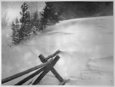
Print demonstrating lack of good contact between plate and film.
Do not
confuse lack of proper contact with the amount of pressure required. In using a
vacuum frame for this process, you shouldn't need alot of pressure. If you're
having problems with dark dots or patches (often caused by newton rings), added
pressure will not necessarily solve the problem (but may make the dots smaller
and darker under added pressure).
B.
Prints that are fuzzy or that have grey tones not in
the transparency may be caused by having the exposed
the wrong side of the image transparency to the plate.
C.
Prints that have visible dot patterns or grey tones
that aren't in the transparency may be caused by having the
exposed the wrong side of the aquatint screen to the plate.
D.
Prints that are too light in tone are usually caused by over-exposure. Adjust your screen and/or image exposure times appropriately.
E.
Prints that are too dark in tone are usually caused by under-exposure. Adjust your screen and/or image exposure times appropriately. It may
also be that your process compensation curve is not providing enough of an
adjustment in the darker regions of your image curve.
F.
Breaks in continuous tone are sometimes the result of paper not being damp enough and/or not
enough pressure on the press. If there appears to be white noise in areas that
should be smooth in your prints, you may want to consider using a wet pack to condition your paper ahead of
time and/or increase the pressure.
G.
Solarization/Posterization (or the look of it) is generally caused by improper exposure of the
screen and/or image. Areas of the image that should be black are coarser and
rougher on the plate as they are not exposed well enough to create a solid dot.
Areas slightly grayer in tone are letting through more light, which hardens the
plate properly in these areas, that subsequently holds
more ink, appearing black.
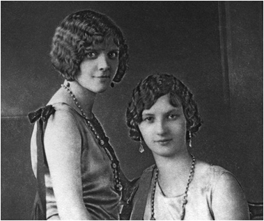
Print demonstrating the "solarization" effect of improper exposure
times.
H.
A Note about Black Light Exposure Units - I have never been able to get a black light exposure unit to work
adequately, even when using a vacuum frame for better contact. They are fine
for making relief plates or small photo images, or in conjunction with coarser
dot screens, but images larger than 4x5" using the finer screen as recommended
in this procedure has produced problems with contact, dark dots, and overall
consistency. I do not recommend them for this process any longer, although I've
used them successfully for platinum/palladium printmaking.
I.
Scratches of a superficial
nature sometimes occur on either the base and/or emulsion side of your
transparencies. These are to be expected and generally do not cause any
problems and are generally remedied with a light cleaning. If, however, you
start to see scratches that are deep and pervasive across the entire film in
the direction of the media's path through the printer here's something to try
if you have an Epson wide format printer: Epson sells a high tension spindle
that solved this problem for me. I bought it when I first got the printer and
only used it as a last resort in an attempt to fix massive scratches on
pictorico film which developed with increasing
frequency over time. Just search the Epson site or your favorite vendor to see
if a 'high tension spindle' is an option for you.
XIV.
Links
A.
The following links are to some of the most excellent
artists, teachers, and vendors I've come across in this endeavor. Many of them
teach workshops, and all are highly
recommended.
§
Intaglio Editions is my company, offering
print and plate making consultation and services.
§
Terra Bear Arts features the artwork I've
created en route to developing this procedure. In spite of my interest in
achieving photographic realism with intaglio printmaking, my primary interest
is in abstract expressionism.
§
Photo artist Karl Koenig gave me some real horror
stories about what happened to him over time for washing out polymer plates
with his bare hands for 3 years. Wear gloves people! Thanks Karl.
§
Brian Pawlowski's Blog contains alot of
good insight into this process.
§
Renaissance Press run by Paul Taylor in
New Hampshire has been particularly helpful in his command of traditional
copper gravure and attention to continuous tone. Paul, like many of us, is
working on finding a reliable source for a fine grained
aquatint screen, usually output by an imagesetter. Quality imagesetters and
people who know how to run them are fast becoming a thing of the past. If you
know of any reliable sources - Contact Paul.
§
Keith Taylor's website - Keith is a
wonderful photographer and photo technician, employing many different processes
to create outstanding photoimagery. His kind advice and experience was
invaluable in getting my process relatively bug-free.
§
Susan Daly Voss's Photo Gravure Blog -
Susan is documenting the process of learning Polymer Photogravure and has been
an excellent resource and tester for alot of the approaches I recommend in this
procedure. Besides being a dedicated and accomplished printmaker, she's also a fabulous painter.
§
Christina Z. Anderson - Photography
instructor and author, Chris' work is diverse, meticulous, haunting and
humorous.
§
Angela Faris Belt - Accomplished fine arts
photographer and instructor, Angela's pursuit of polymer photogravure was
prompted through an allergy she developed to photochemistry.
§
Clinton Cline - Clinton has been full time
Faculty at CU Boulder and head of the Printmaking Department for decades. His
in-depth knowledge of printmaking and constructive feedback has been incredibly
helpful.
§
David Hoptman - Artist, Photographer, and
Printmaker David Hoptman pioneered the use of the finer aquatint screen for use
with photographic images, with help from Don Messec.
§
Making Art Safely is Don Messec's
consulting firm specializing in workshops and consultation on the safe studio
design and production of art.
§
Dan Burkholder's Website - Dan is the
author of Making Digital Negatives for Contact Printing, and is the main
pioneer in that field. His Tiny Tutorials on Photoshop are downloadable gems of
wisdom.
§
Dan Welden's Solarplate Website - Dan is
the printmaker who first discovered the use of Polymer plates for intaglio. His
workshops and book, Printmaking in the Sun, are excellent resources for
beginners.
§
Mark Lunning runs Open Press, Ltd. - a
Fine Art Printmaking Facility in Denver, Colorado. Mark is well versed in all
forms of traditional printmaking.
§
Patricia Brandstead is the owner of Kozo Fine Arts Materials - a Fine Art
Paper and Art supply store in Denver, Colorado. Patricia is a master papermaker
and printmaker with incredible knowledge of, and great deals on, paper and
printmaking materials.
§
Boxcar Press - Distributor of the
Printtight KM73 plate and other polymer plate services and supplies.
§
Precision Digital Negatives by Mark Nelson
is the definitive, state-of-the-art process for creating digital negatives for
alternative photographic processes using chromatic density, instead of black
ink, to block light.
§
CopyGraphics in Santa Fe sells custom,
imagesetter film (which some people prefer to inkjet transparencies) and custom
aquatint screens.
§
Pictorico is the company that makes
Pictorico OHP Premium transparency stock, which is recommended for making
digital inkjet transparencies using this procedure.
§
The Alt-Photo-Process Mailing List out of
Saskatchewan is an amazing resource of people with enormous experience in all
forms of alternative photography.
§
Bostick and Sullivan - They sell supplies
pertaining to, and have a wide range of knowledge about, many alternative
photographic processes.
§
Takach Press - Dave Takach and family have
been in the business for over 30 years and make the best intaglio presses on
the planet.
§
Refurbished Exposure Units are sold by Larry Hall of RM Services in Denver, Colorado 303-941-0687. Larry is the Olec repair tech to the stars here along the front range
of the Western U.S. Both Larry and Don Messec out of Santa Fe sell
refurbished metal-halide exposure units with vacuum frames (which are required for
this procedure). You can expect to pay between $1,000 and $3,000 for a
refurbished unit which, when new, go for well over 10K. You can also buy used
ones on Ebay. New plate burners start at around 5K.
§
Self-Adhestive Sheet Magnets for putting on the bottom of processing trays and on the front of boards
for inking can be found at Custom-Magnets.com. I get the thickest
size.
_ 2006-2009 Chronosynthesis Productions, Inc.
This document may not be reproduced in whole or in part without expressed
written permission of the author.